ControlPanel
The ControlPanel simulation component is designed to manage a collection of control elements, such as buttons, switches,
or analogue controls, each of which can have associated outputs.
The ControlPanel facilitates the dynamic addition, removal, and modification of these control elements
Notably, some control elements, such as push buttons and switches, can also have light indicators which can be set from external.

When to use
Use the ControlPanel simulation component when you need to manage a set of interactive controls that generate outputs, such as in a simulated control system or user interface. This component is ideal for scenarios where you need to dynamically adjust controls during simulation or provide visual feedback through indicator lights associated with specific controls. The component is also often used to simulate the control panel of a machine.
How to use
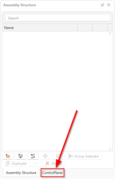
Add this simulation component from the simulation component library. A tab is created in the left-hand area of the user interface.
Adding control elements
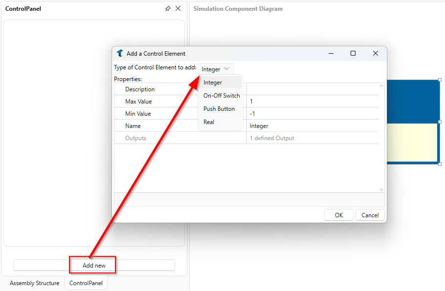
To add a control press the button of the same name. A window opens. The desired type can now be selected in the drop-down menu.
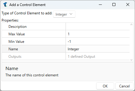
Integer Control
A control element that outputs an integer value. A name and a description can be specified. The limits of the control can also be set.
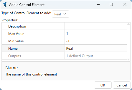
Real Control
A control element that outputs a real (floating point) value. A name and a description can be specified. The limits of the control can also be set.
Push-Button Control
A control element that outputs a boolean value that is only active (high) while the button is being pressed. It is commonly used for actions that should only occur while the button is held down, such as a trigger or a reset function.
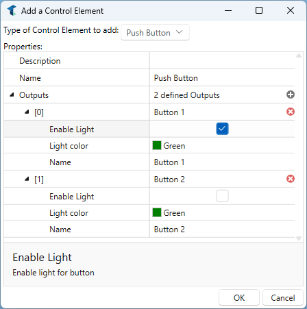
The control can consist of several instances. Each instance has its own name and description. You can also determine whether a light indicator should be used.
An additional input is then created. If this input changes to true, the indicator lights up with the defined color.

On-Off Switch Control
A toggle control element that alternates between an on (high) and off (low) state with each press. This is typically used for controls that maintain their state, like power switches or mode selectors.
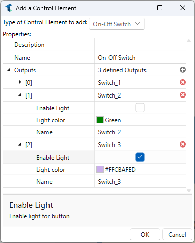
The control can consist of several instances. Each instance has its own name and description. You can also determine whether a light indicator should be used.
An additional input is then created. If this input changes to true, the indicator lights up with the defined color.

Parameters
Name
Indicates the name of the simulation component instance. The tab which has been created also has this name.
Example
In this example, the ControlPanel simulation component is used to simulate the control panel of the machine to start, stop, request access or quit the machine.
Some controls were created whose outputs were connected directly to the corresponding PLC. The stop output is a closed contact, which is why it is connected to the controller in inverted form.
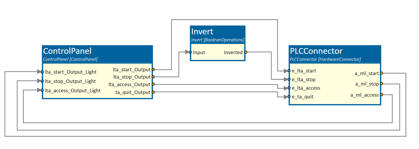
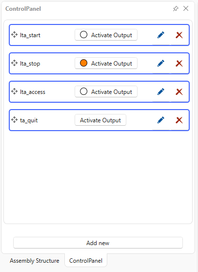
The Start, Stop and Access buttons have activated indicator lights that are switched by the PLC.
Further Information
For more details visit the Video Guides section, where you can find a video guide demonstrating this topic under Push-off and stopper cylinders.